

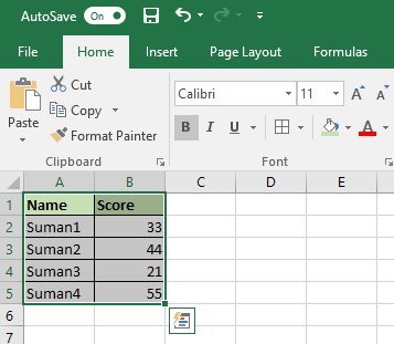
1. Select the data set as shown below:
2. Click on insert tab and select pi chart option as shown below:
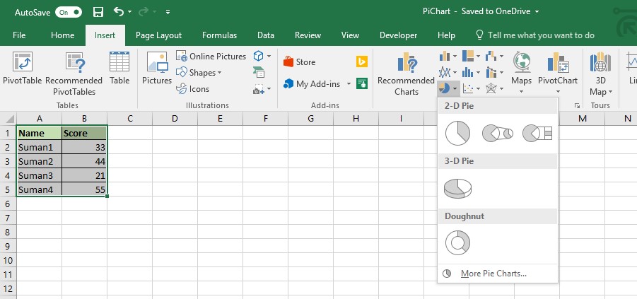
3. Select any of the option from available option as per your preference, in this case I am selecting 1st available option:
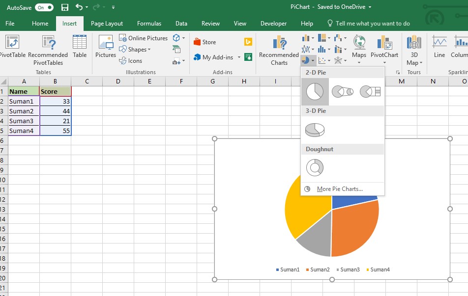
4. After selecting type of pi chart excel will again you option to select design as you can see below, select one as per your preference.
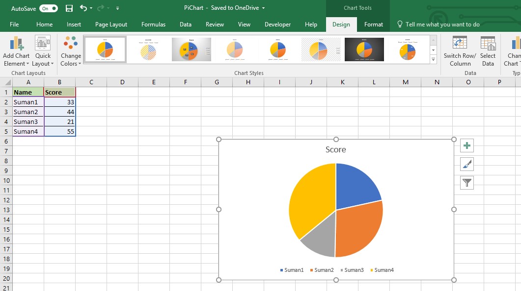
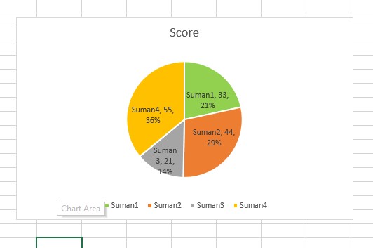
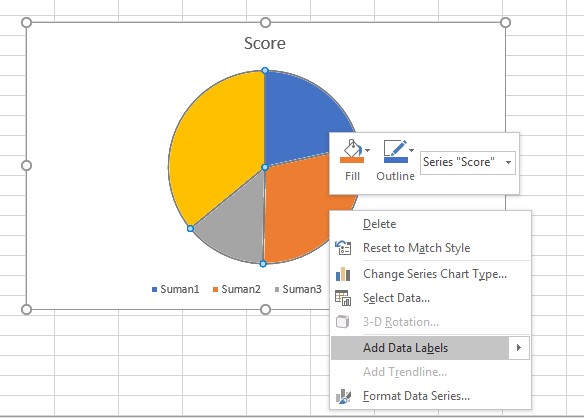
5. Now we can see all the names and their scores in chart, lets try to add more details into it like % of and exact score of each name:
click on chart area as shown below, right click, and select the option add Data labels:
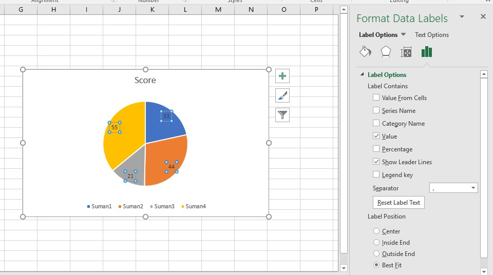
6. Now you be able to see the score value for each name, now lets try to add % as well:
select the graph area and select Format data labels and select desired Label Options from menu displayed in right side:
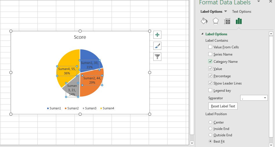
7. I have selected Percentage and Category Name, graph will change as you can see below, one can also play with available options.
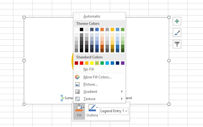
8. We are done with data representation lets try to change the color of graph area:
Select the labels -> double click on label -> right click and select the desired color from the fill option:
9. Similarly you change the color of other labels, final graph will look like shown below, suman1 section with change from blue to green.